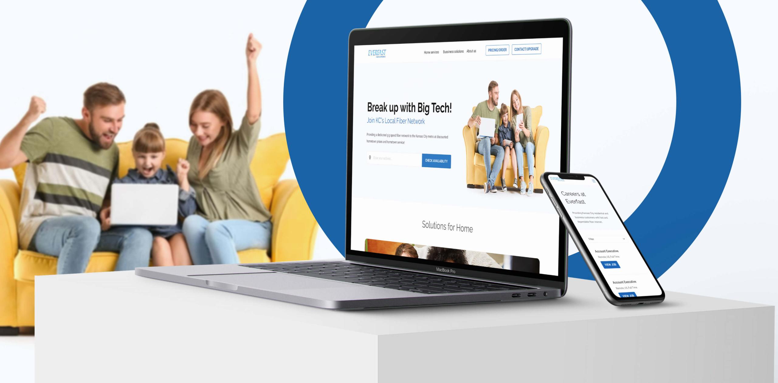
User-Centric Web Portal for an Internet Provider in Kansas City

Kansas Telecom: From Startup to Standout
A user-friendly web portal is needed to showcase services and attract new customers effectively. A telecommunications client in Kansas, USA, sought to establish a web portal to showcase its services and attract new customers. As a spinoff from a larger company, it faced significant challenges, including a lack of resources, a logo, and a cohesive visual identity.
Rapid Growth of a Kansas ISP
The primary objective was to design and launch a web portal for internet services in the Kansas Metropolitan Area as swiftly as possible. The client’s biggest hurdle was the lack of marketing materials and resources, which at the time stemmed from their underdeveloped brand. Our team stepped in to create a fully functional platform while simultaneously crafting their branding from the ground up, ensuring they could start offering services without delay.
Web Portal for Easy Service Verification and Customer Engagement
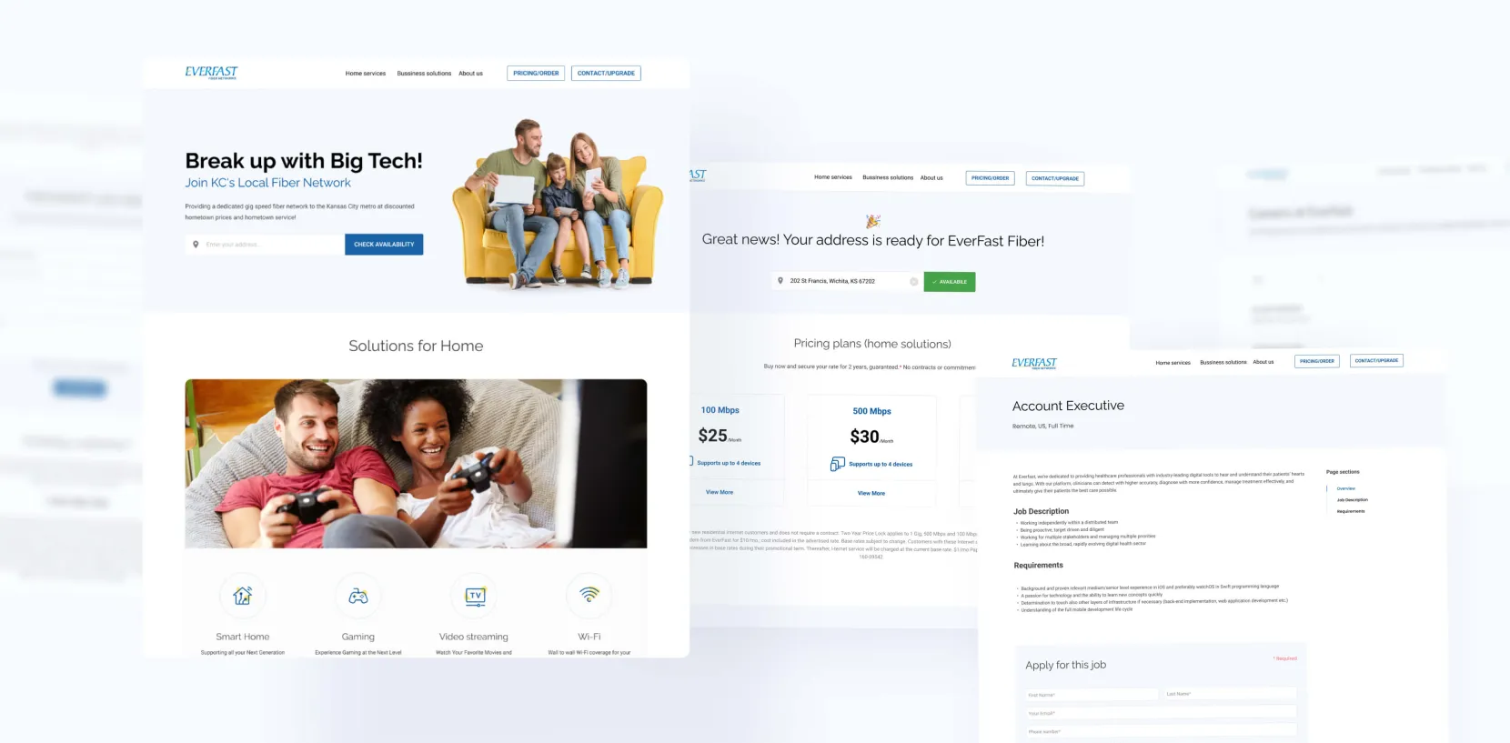
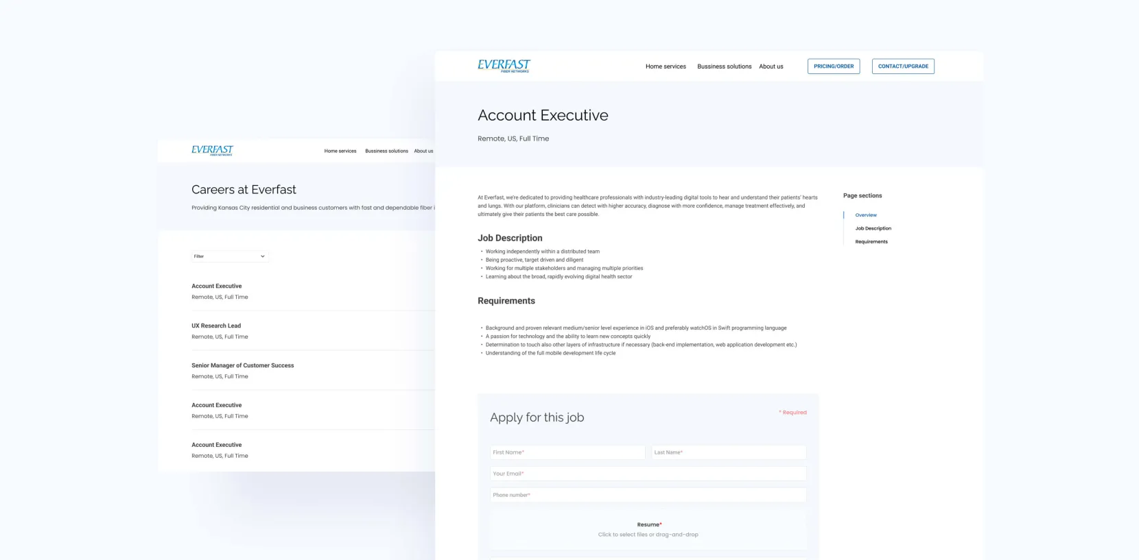
We designed and developed a web portal featuring key functionalities, including a coverage verification tool that allows users to check service availability effortlessly. Additionally, we integrated an active form feature to facilitate direct customer acquisition through the website. Beyond the portal, we also designed a first logo and a foundational design manual, which became instrumental in the client’s overall communication strategy.
Services We Provided
UX/UI Design
Web Development
Project Management
QA & Testing
From Concept to Launch in Record Time
The client needed a presentation website in two weeks. It must include signal measurement tools and a customer inquiry form. Our collaboration started with an initial meeting, followed by three design iterations. We moved into development upon design approval, making adjustments throughout the process. The result was a presentation website with a contact form and a location-based service availability feature.
Generating Dozens of New Client Inquiries and Filling Forms in Just One Week
We successfully designed and developed the web portal, created the first logo, and prepared a core brand manual. The contact form generated dozens of submissions in the first week alone, while the website attracted thousands of visitors. Also, the client refined and used parts of the brand identity we developed, even after the project ended.
Get in Touch with Us
Fill in this form, or, if you prefer, send us an email. Don’t worry, we’ll send you an NDA and your idea will be safe.
Do you want to be our client?


